> ## Documentation Index
> Fetch the complete documentation index at: https://dndkit.com/llms.txt
> Use this file to discover all available pages before exploring further.
# DragOverlay
> Render a custom element as visual feedback during drag operations.
## Overview
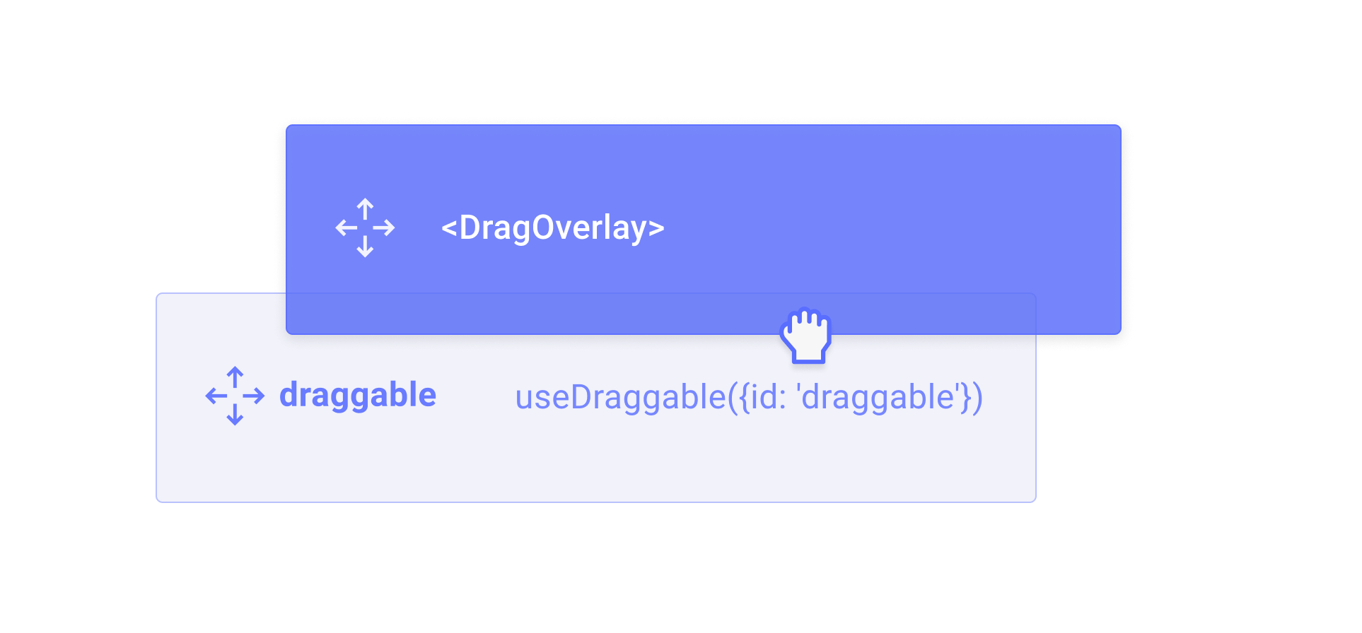
The `DragOverlay` component renders a custom overlay element while a drag operation is in progress. This allows you to display a completely different element than the one being dragged, which is useful for rendering a styled clone, a preview, or a simplified representation of the dragged element.
## Usage
Import and place the `DragOverlay` component inside a [`DragDropProvider`](/react/components/drag-drop-provider). Its children will only be rendered when a drag operation is active.
```jsx theme={null}
import {useDraggable, DragOverlay} from '@dnd-kit/react';
function Draggable() {
const {ref} = useDraggable({id: 'draggable'});
return (
<>
I will be rendered while dragging...
);
}
```
You should only render the `DragOverlay` component once per [DragDropProvider](/react/components/drag-drop-provider) component.
### Rendering based on the drag source
To get around the fact that the `DragOverlay` component should only be rendered once, you can pass a function as a child, which will receive the `source` as an argument. This is useful for rendering different content depending on which element is being dragged.
```jsx theme={null}
import {DragDropProvider, DragOverlay} from '@dnd-kit/react';
function App() {
return (
{source => (
Dragging {source.id}
)}
);
}
```
### Customizing the drop animation
By default, when a drag operation ends, the overlay animates back to the position of the source element. You can customize or disable this animation using the `dropAnimation` prop.
```jsx theme={null}
{/* Disable the drop animation */}
No animation on drop
{/* Customize the animation timing */}
Fast drop animation
{/* Provide a custom animation function */}
{
// Custom animation logic using Web Animations API, GSAP, etc.
}}>
Custom animation
```
## Props
The content to render as the drag overlay. Only rendered when a drag operation is in progress. Can be a React node or a function that receives the drag `source` as an argument.
The HTML tag to render as the overlay wrapper element.
Whether the drag overlay is disabled. Can be a boolean or a function that receives the current drag source.
Customize or disable the drop animation that plays when a drag operation ends.
* `undefined` – use the default animation (`250ms` ease)
* `null` – disable the drop animation entirely
* `{duration, easing}` – customize the animation timing
* `(context) => Promise | void` – provide a fully custom animation function
CSS class name for the overlay wrapper element.
Inline styles for the overlay wrapper element.
 ## Usage
Import and place the `DragOverlay` component inside a [`DragDropProvider`](/react/components/drag-drop-provider). Its children will only be rendered when a drag operation is active.
```jsx theme={null}
import {useDraggable, DragOverlay} from '@dnd-kit/react';
function Draggable() {
const {ref} = useDraggable({id: 'draggable'});
return (
<>
## Usage
Import and place the `DragOverlay` component inside a [`DragDropProvider`](/react/components/drag-drop-provider). Its children will only be rendered when a drag operation is active.
```jsx theme={null}
import {useDraggable, DragOverlay} from '@dnd-kit/react';
function Draggable() {
const {ref} = useDraggable({id: 'draggable'});
return (
<>