> ## Documentation Index
> Fetch the complete documentation index at: https://dndkit.com/llms.txt
> Use this file to discover all available pages before exploring further.

# useDraggable

> Use the `useDraggable` hook to make draggable elements that can dropped over droppable targets.

export const draggableStyles = `
body {
  padding: 1em;
  font-family: system-ui, sans-serif;
  -webkit-font-smoothing: antialiased;
}

.btn {
  display: flex;
  width: min-content;
  height: min-content;
  align-items: center;
  gap: 6px;
  font-size: 20px;
  font-weight: 900;
  cursor: grab;
  padding: 14px 18px;
  background: #000;
  color: #FFF;
  border-radius: 10px;
  border: none;
  transition: transform 0.25s ease, box-shadow 0.2s ease;
}

.btn::before {
  content: '';
  display: inline-block;
  width: 34px;
  height: 34px;
  background-image: url("data:image/svg+xml,%3Csvg xmlns='http://www.w3.org/2000/svg' width='43' height='43' viewBox='0 0 43 43' fill='none'%3E%3Cpath d='M4.55229 25.6017L20.5499 20.8985C21.4951 20.6173 22.3778 21.5001 22.1044 22.4532L17.402 38.4532C17.0817 39.5392 15.5897 39.672 15.082 38.6563L12.8401 34.1798C12.7855 34.0782 12.723 33.9767 12.6449 33.8907L5.77086 40.7657C4.79444 41.7423 3.20873 41.7423 2.23231 40.7657C1.2559 39.7892 1.2559 38.2032 2.23231 37.2267L9.10631 30.3517C9.02038 30.2735 8.92665 30.2032 8.81729 30.1563L4.34919 27.922C3.33372 27.4142 3.46651 25.922 4.55229 25.6017Z' fill='white'/%3E%3Cpath transform-origin='25 50%25' d='M22.4324 30.2031L21.3153 34H21.5028C28.408 34 34.001 28.4062 34.001 21.5C34.001 14.5938 28.408 9 21.5028 9C14.5976 9 9.00464 14.5938 9.00464 21.5V21.6875L12.801 20.5703C13.2696 16.1719 16.9878 12.75 21.5028 12.75C26.338 12.75 30.2515 16.6641 30.2515 21.5C30.2515 26.0156 26.8302 29.7344 22.4324 30.2031Z' fill='white' fill-opacity='0.7'%3E%3Canimate attributeName='fill-opacity' begin='0' values='0;0.7;0.7;0' keyTimes='0; 0.2; 0.85; 1' dur='4s' repeatCount='indefinite'/%3E%3CanimateTransform attributeName='transform' type='scale' values='0 0; 1 1; 1 1; 0 0' keyTimes='0; 0.1; 0.9; 1' begin='0s' dur='4s' repeatCount='indefinite'/%3E%3C/path%3E%3Cpath transform-origin='25 50%25' d='M37.7505 21.5C37.7505 30.4766 30.4782 37.75 21.5029 37.75V37.7422C21.0733 37.7422 20.6515 37.7266 20.2297 37.6953L19.1517 41.3594C19.925 41.4531 20.7062 41.5 21.5029 41.5C32.5482 41.5 41.5 32.5469 41.5 21.5C41.5 10.4531 32.5482 1.5 21.5029 1.5C10.4577 1.5 1.50586 10.4531 1.50586 21.5C1.50586 22.2969 1.55273 23.0781 1.64646 23.8516L5.30218 22.7734C5.27093 22.3516 5.25531 21.9297 5.25531 21.5C5.25531 12.5234 12.5277 5.25 21.5029 5.25C30.4782 5.25 37.7505 12.5234 37.7505 21.5Z' fill='white' fill-opacity='0.4'%3E%3Canimate attributeName='fill-opacity' begin='0.1s' values='0;0.4;0.4;0' keyTimes='0; 0.2; 0.85; 1' dur='4s' repeatCount='indefinite'/%3E%3CanimateTransform attributeName='transform' type='scale' values='0 0; 1 1; 1 1; 0 0' keyTimes='0; 0.1; 0.9; 1' begin='0.1s' dur='4s' repeatCount='indefinite'/%3E%3C/path%3E%3Cdiv xmlns='' style='all: initial !important;'/%3E%3C/svg%3E");
  background-size: contain;
  background-repeat: no-repeat;
}

.btn[aria-grabbed="true"] {
  transform: scale(1.025);
  box-shadow: inset 0px 0px 1px rgba(0,0,0,0.5), -1px 0 15px 0 rgba(34, 33, 81, 0.01), 0px 15px 15px 0 rgba(34, 33, 81, 0.25)
}
`.trim();

export const CodeSandbox = ({files, height, hero, previewHeight, showTabs, template}) => {
  const [Editor, setEditor] = useState(null);
  useEffect(() => {
    import('@components/CodeSandbox').then(mod => {
      setEditor(() => mod.CodeSandbox);
    });
  }, []);
  if (!Editor) return null;
  return <div className={`not-prose${hero ? ' hero' : ''}`} style={previewHeight ? {
    '--preview-height': `${previewHeight}px`
  } : undefined}>
      <Editor files={files} height={height} showTabs={showTabs} template={template} />
    </div>;
};

export const Story = ({id, framework = "react", width = "100%", height = "250", hero = false}) => {
  const BRANCH = 'experimental';
  const STORYBOOKS = {
    react: {
      localPort: 6006,
      productionHost: '5fc05e08a4a65d0021ae0bf2'
    },
    vue: {
      localPort: 6008,
      productionHost: '6989440ed560d70abcd6bcc7'
    },
    vanilla: {
      localPort: 6007,
      productionHost: '69892d294eb9040f0d29aa81'
    },
    solid: {
      localPort: 6009,
      productionHost: '698944444eb9040f0d2a0217'
    },
    svelte: {
      localPort: 6010,
      productionHost: '69910d2a631cb57638616dcd'
    }
  };
  const config = STORYBOOKS[framework] ?? STORYBOOKS.react;
  const isDev = import.meta.env.DEV;
  const host = isDev ? `//localhost:${config.localPort}` : `https://${BRANCH}--${config.productionHost}.chromatic.com`;
  return <Frame>
      <iframe src={`${host}/iframe.html?args=&id=${id}&viewMode=story&hero=${hero}`} width={width} height={height} />
    </Frame>;
};

<CodeSandbox
  files={{
'App.js': {code: app, hidden: true},
'Draggable.js': {code, active: true},
'styles.css': {code: draggableStyles, hidden: true},
}}
  height={220}
  previewHeight={200}
  hero
/>

The `useDraggable` hook requires an `id` and accepts all the same options as the `Draggable` class. Refer to the [Input](#input) section below for more information.

## API Reference

<Note>
  The `useDraggable` hook is a thin wrapper around the [Draggable](/concepts/draggable) class that makes it easier to create draggable elements in React. It therefore accepts all of the same input arguments.
</Note>

### Input

The `useDraggable` hook accepts the following arguments:

<ParamField path="id" type="string | number" required>
  The identifier of the draggable element. Should be unique within the same [drag and drop context provider](/react/components/drag-drop-provider).
</ParamField>

<ParamField path="type" type="string | number | Symbol">
  Optionally supply a type to only allow this draggable element to be dropped over droppable targets that [accept](/concepts/droppable) this `type`.
</ParamField>

<ParamField path="element" type="Element | Ref<Element>">
  If you already have a reference to the element, you can pass it to the `element` option instead of using the `ref` that is returned by the `useDraggable` hook to connect the draggable source element.
</ParamField>

<ParamField path="handle" type="Element | Ref<Element>">
  If you already have a reference to the drag handle element, you can pass it to the `handle` option instead of using the `handleRef` that is returned by the `useDraggable` hook to connect the drag handle element.
</ParamField>

<ParamField path="disabled" type="boolean">
  Set to `true` to prevent the draggable element from being draggable.
</ParamField>

<ParamField path="plugins" type="PluginDescriptor[]">
  An array of plugin descriptors for per-entity plugin configuration. Use `Plugin.configure()` to create descriptors. For example, `Feedback.configure({ feedback: 'clone' })`.
</ParamField>

<ParamField path="modifiers" type="Modifier[]">
  An array of [modifiers](/extend/modifiers) that can be used to modify or restrict the behavior of the draggable element.
</ParamField>

<ParamField path="sensors" type="Sensors[]">
  An array of [sensors](/extend/sensors) that can be bound to the draggable element to detect drag interactions.
</ParamField>

<ParamField path="alignment" type="{ x: 'start' | 'center' | 'end'; y: 'start' | 'center' | 'end' }">
  How the draggable's position should be aligned relative to its source element during drag operations. Used by the [Feedback plugin](/extend/plugins/feedback) when computing overlay placement.
</ParamField>

<ParamField path="data" type="{[key: string]: any}">
  The data argument is for advanced use-cases where you may need access to additional data about the draggable element in event handlers, modifiers, sensors or custom plugins.
</ParamField>

<ParamField path="effects" type="() => Effect[]">
  <Info>This is an advanced feature and should not need to be used by most consumers.</Info>
  You can supply a function that returns an array of reactive effects that can be set up and automatically cleaned up when the component invoking the `useDraggable` hook element is unmounted.
</ParamField>

### Output

The `useDraggable` hook returns an object containing the following properties:

<ResponseField name="ref" type="(element: Element) => void">
  A [ref callback function](https://react.dev/reference/react-dom/components/common#ref-callback) that can be attached to the element that you want to make draggable.
</ResponseField>

<ResponseField name="handleRef" type="(element: Element) => void">
  A [ref callback function](https://react.dev/reference/react-dom/components/common#ref-callback) that can be attached to an element to create a drag handle.
</ResponseField>

<ResponseField name="isDragSource" type="boolean">
  A boolean value that indicates whether the draggable is the source of the drag operation that is in progress.
</ResponseField>

<ResponseField name="isDragging" type="boolean">
  A boolean value that indicates whether the draggable is currently being dragged.
</ResponseField>

<ResponseField name="isDropping" type="boolean">
  A boolean value that indicates whether the draggable is being dropped. This can be used to style the draggable element differently during the drop animation.
</ResponseField>

<ResponseField name="draggable" type="Draggable">
  The [draggable](concepts/draggable) instance that is created by the `useDraggable` hook.
</ResponseField>

## Guides

### Specifying a drag handle

To specify a drag handle, provide a reference to an element and pass it as the `handle` argument to the `useDraggable` hook. Alternatively, you can consume the `handleRef` ref callback to connect the drag handle element.

```jsx theme={null}
import {useDraggable} from '@dnd-kit/react';

function Draggable(props) {
  const {ref, handleRef} = useDraggable({
    id: props.id,
  });

  return (
    <div ref={ref}>
      Draggable
      <button ref={handleRef}>Drag handle</button>
    </div>
  );
}
```

<Note>
  When you connect a drag handle element, only the element that is connected to the `handleRef` will initiate the drag operation.
</Note>

<Story id="react-draggable-drag-handles--drag-handle" />

### Restricting dragging using modifiers

Use [modifiers](/extend/modifiers) to modify or restrict the behavior of draggable elements.

Modifiers let you dynamically modify the movement coordinates that are detected by sensors. They can be used for a wide range of use cases, for example:

* Restricting motion to a single axis
* Restricting motion to the draggable node container's bounding rectangle
* Restricting motion to the draggable node's scroll container bounding rectangle
* Applying resistance or clamping the motion

Modifiers can be applied globally on the [\<DragDropProvider>](/react/components/drag-drop-provider) component or locally on individual draggable elements.

Here is an example of how to restrict dragging to the horizontal axis:

```jsx theme={null}
import {useDraggable} from '@dnd-kit/react';
import {RestrictToHorizontalAxis} from '@dnd-kit/abstract/modifiers';

function Draggable({id}) {
  const {ref} = useDraggable({
    id,
    modifiers: [RestrictToHorizontalAxis],
  });
}
```

<Story id="react-draggable-modifiers--horizontal-axis" height="130" />

And here is an example of how to restrict dragging to the container element of the draggable:

```jsx theme={null}
import {useDraggable} from '@dnd-kit/react';
import {RestrictToElement} from '@dnd-kit/dom/modifiers';

function Draggable({id}) {
  const {ref} = useDraggable({
    id,
    modifiers: [RestrictToElement.configure({element: document.body})],
  });
}
```

<Story id="react-draggable-modifiers--container-modifier" height="500" />

export const app = `
import {Draggable} from './Draggable.js';
import './styles.css';

export default function App() {
  return <Draggable id="draggable"/>;
}
`.trim();

export const code = `
import {useDraggable} from '@dnd-kit/react';

export function Draggable(props) {
  const {ref} = useDraggable({
    id: props.id,
  });

  return <button ref={ref} className="btn">draggable</button>;
}
`.trim();

### Rendering a drag overlay

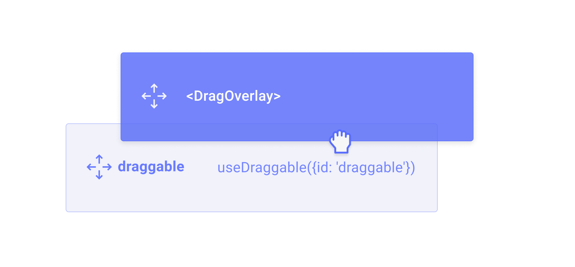
You can render a completely different element while the draggable element is being dragged by using the [`<DragOverlay>`](/react/components/drag-overlay) component.

<img src="https://mintcdn.com/dnd-kit/mkvHCrAQiGvjrBWI/images/draggable/drag-overlay.png?fit=max&auto=format&n=mkvHCrAQiGvjrBWI&q=85&s=74e5f2e74671637bd92f868b7f520ede" width="1926" height="896" data-path="images/draggable/drag-overlay.png" />

```jsx theme={null}
import {useDraggable, DragOverlay} from '@dnd-kit/react';

function Draggable() {
  const {ref} = useDraggable({
    id: 'draggable',
  });

  return (
    <>
      <button ref={ref}>
        Draggable
      </button>
      <DragOverlay>
        <div>I will be rendered while dragging...</div>
      </DragOverlay>
    </>
  );
}
```

The `<DragOverlay>` component will only render its children when a drag operation is in progress. This can be useful for rendering a completely different element while the draggable element is being dragged.

<Warning>
  You should only render the `<DragOverlay>` component once per [DragDropProvider](/react/components/drag-drop-provider) component.
</Warning>

To get around the fact that the `<DragOverlay>` component should only rendered once, you can also pass a function as a child to the `<DragOverlay>` component, which will receive the `source` as an argument. This can be useful for rendering a clone of the source element while it is being dragged.

```jsx theme={null}
import {useDraggable, DragOverlay} from '@dnd-kit/react';

function App(props) {
  return (
    <DragDropProvider>
      <Draggable id="foo" />
      <Draggable id="bar" />
      <DragOverlay>
        {source => (
          <div>
            Dragging {source.id}
          </div>
        )}
      </DragOverlay>
    </DragDropProvider>
  );
}
```
